Database ER Diagram 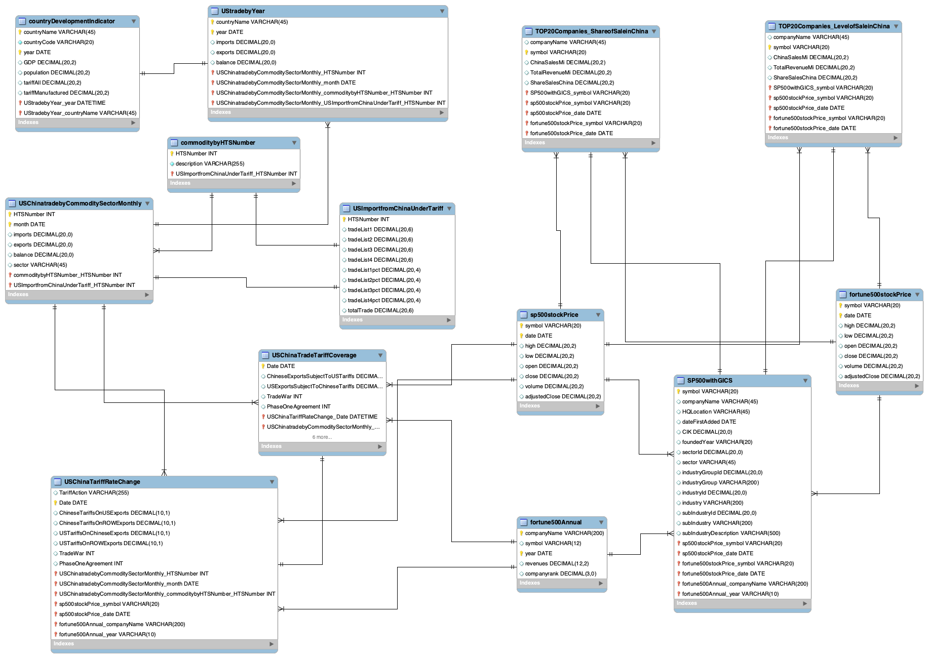
Instructor: Dr. Karl Ho
Min Shi
May 12, 2022
The database aims to serve people interested in US-China trade war and its effect on US-China trade volumes, and the impact on US multinational corporations (MNCs) which depend on global value chains (GVC) heavily.
The database provides mainly two types of data. The first type is the macroscopic data. Specifically, this database provides US-China monthly trade data by commodity, the volume and percentage of products under tariff data between US and China. It also contains the data about US annual trade with all countries and the basic development indicator information of these countries, including GDP, population, tariff rate in general, and tariff rate for manufactured products. The second type of data is the microcosmic data about MNCs, including S&P 500 company list with detailed information, such as stock symbol, location, sector, industry, etc., S&P 500 company stock price time-series data, fortune 500 company list and their annual revenues data, fortune 500 company stock price time-series data, top 20 companies list based on their level of sale in China, and top 20 companies list based on their share of sale in China.
People could utilize this dataset to explore how U.S.-China trade relations change in the 21st century, the connection between U.S.-China trade and their tariff change, the differences in the tendencies of US trade with different companies, how U.S.-China trade relations affect U.S. multinational corporations (MNCs).
The trade between the U.S. and China started since 1971 when the U.S. officially ended its trade embargo on China. In 1979, when the two sides officially re-established diplomatic relations and signed a bilateral trade agreement, the U.S.-China trade volume began to grow. In 2001, China's entry into the World Trade Organization (WTO) changed China's economy to an export-driven pattern, contributing to China's rapid development of its economy and international trade (Wang 2013). The U.S. has become the largest destination for China's exports since 2000 (Shen et al. 2020). During the first decade of the twenty-first century, both U.S. and China attach great importance to their economic cooperation, and their trade relations have expanded rapidly. From China's side, bilateral trade with the U.S. and foreign investment from the U.S. side is crucial for China's continuous development and modernization. From the perspective of the U.S., China's rapid development speed brings enormous potential market and economic activity while the government begins to raise a concern about its national security (Wang 2013).
In 2010, China became the second-largest economy after the U.S. in terms of GDP. Since the Obama administration, the U.S. has treated China as the biggest challenger and a strategic competitor. After Donald Trump took office in 2017, the U.S. government focused on the trade unbalance between the U.S. and China. In January 2018, U.S. President Donald Trump began imposing tariffs and other trade barriers on China to force it to change what the U.S. calls "unfair trade practices" and theft of intellectual property (Wikipedia Foundation, 2021), which is a signal for the following outbreak of the U.S.-China trade war.
U.S. and China relations have worsened in the past few years, starting from the U.S.-China trade war. The imposed tariffs from both sides impede the normal GVC circulation, increase the manufacturing cost, and further reduce the profits margins of U.S. MNCs. Moreover, worsened U.S.-China relations bring growing anti-U.S. sentiment in China and raises the risk of nationalistic reactions and boycotts, which affect the sales of U.S. MNC productions in China, which holds the world’s largest markets for retail, chemicals, chips, and other industries (Kapadia, 2021).
Thus, utilizing macroscopic and microcosmic data to explore the U.S.-China trade status and the revenues of MNCs overtime is necessary to evaluate the effect of the U.S.-China trade war on the economy.
This database includes thirteen tables and the relations among these tables are shown in the ER diagram below.
Database ER Diagram
The database implementation is mainly through the R Shiny app \& python.
As for the Shiny app, I inner join the fortune500stockPrice Table and SP500withGICS Table on the Symbol column and generate a combined table about the daily time-series stock data of the public companies within the Fortune 500 list between 2017-01-01 and 2021-09-09 with 423,753 rows and seven columns, including symbol, company name, headquarter location, sector, industry, Date, AdjClose.
The results could be accessed through the shiny app link and the screenshot below shows what the Shiny App looks like.
R Shiny App Example 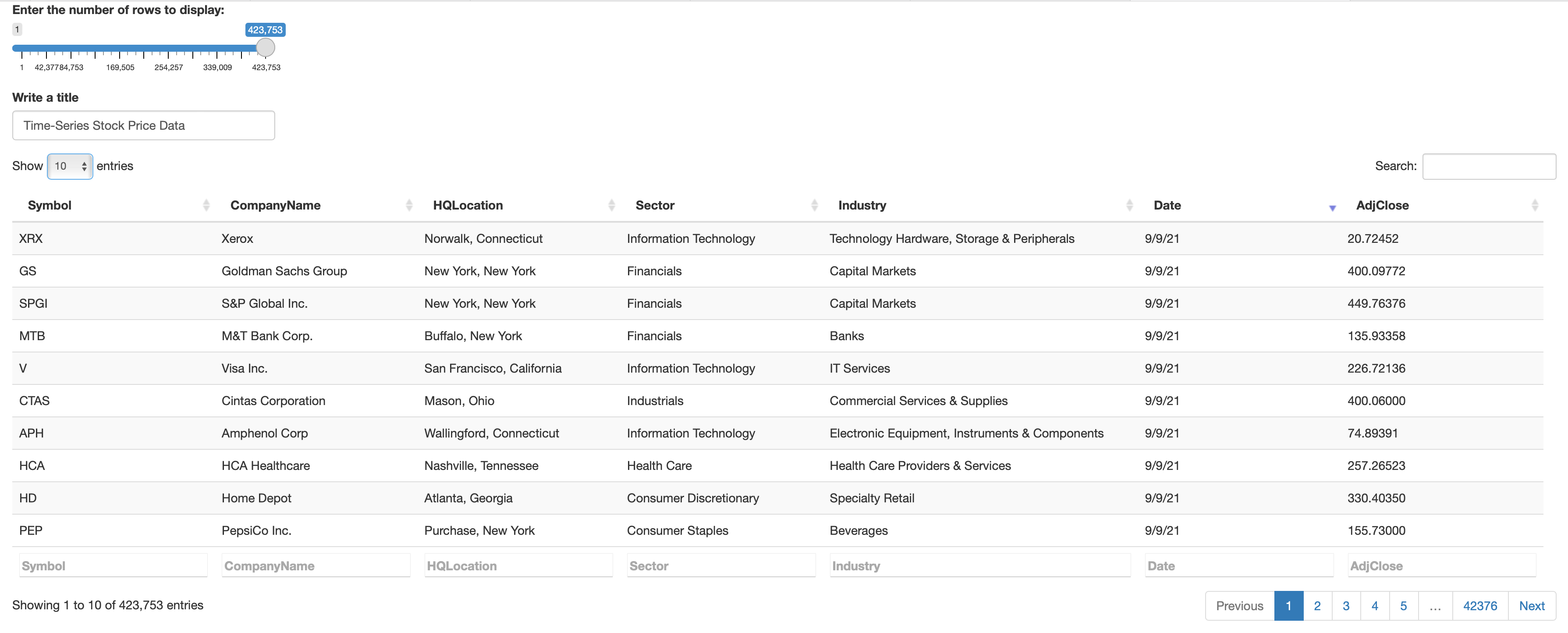
As for python implementation, I connect to postgresql database through two steps. Firstly, I install ipython-sql package, and this package introduces a %sql (or %%sql) magic to your notebook, allowing you to connect to a database. Secondly, I install psycopg2 package, the most popular PostgreSQL database adapter for the Python programming language.
#!pip install ipython-sql
#!pip install psycopg2
#!pip install nbconvert
#!brew install pandoc
%load_ext sql
%sql postgresql://postgres:******@127.0.0.1:5433/6354Database
import seaborn as sns
import matplotlib.pyplot as plt
import pandas as pd
import numpy as np
import re
import warnings
warnings.filterwarnings('ignore')
After connecting to PostgreSQL, I could extract data from the database using SQL command. Next, I use pandas and NumPy packages to deal with the data extracted. Besides, I use matplotlib and seaborn packages to do statistical visualization. Finally, the statsmodels package is utilized to do time-series analysis.
And the following part shows some data analysis examples.
%%sql result_set1_1 <<
select * from countryDevelopmentIndicator cdi
where cdi.year >= '2014-01-01'
 * postgresql://postgres:***@127.0.0.1:5433/6354Database
1519 rows affected.
Returning data to local variable result_set1_1
df1_1 = result_set1_1.DataFrame()
df1_1['year'] = df1_1['year'].astype('datetime64')
df1_1.head()
| countryname | countrycode | year | gdp | population | tariffall | tariffmanufactured | |
|---|---|---|---|---|---|---|---|
| 0 | Barbados | BRB | 2017-01-01 | 4978000000.00 | 286229.00 | None | None |
| 1 | Aruba | ABW | 2015-01-01 | 2962905028.00 | 104339.00 | 10.02 | 11.09 |
| 2 | Afghanistan | AFG | 2015-01-01 | 19134211764.00 | 34413603.00 | None | None |
| 3 | Albania | ALB | 2015-01-01 | 11386850130.00 | 2880703.00 | 3.58 | 0.66 |
| 4 | Algeria | DZA | 2015-01-01 | 165979279263.00 | 39728020.00 | 12.02 | 7.66 |
%%sql result_set1_2 <<
select * from UStradebyCountryYear ust
where ust.year >= '2014-01-01'
 * postgresql://postgres:***@127.0.0.1:5433/6354Database
1627 rows affected.
Returning data to local variable result_set1_2
df1_2 = result_set1_2.DataFrame()
df1_2['year'] = df1_2['year'].astype('datetime64')
df1_2.head()
| countryname | year | imports | exports | balance | |
|---|---|---|---|---|---|
| 0 | Afghanistan | 2015-01-01 | 23601251 | 478711524 | 455110273 |
| 1 | Afghanistan | 2016-01-01 | 33715926 | 913874351 | 880158425 |
| 2 | Afghanistan | 2017-01-01 | 14423622 | 942232031 | 927808409 |
| 3 | Afghanistan | 2018-01-01 | 29408728 | 1227404432 | 1197995704 |
| 4 | Afghanistan | 2019-01-01 | 38744074 | 757769159 | 719025085 |
df1 = pd.merge(df1_1, df1_2, left_on = ['countryname', 'year'], right_on = ['countryname', 'year'], how = 'left')
df1['gdp'] = df1['gdp']/1000000
df1['population'] = df1['population']/1000000
df1['imports'] = df1['imports']/1000000
df1['exports'] = df1['exports']/1000000
df1['balance'] = df1['balance']/1000000
ilocList = []
for i in range(len(df1['countryname'])):
    if df1.iloc[i]['countryname'] in ['China', 'United States', 'Japan', 'United Kingdom', 'France', 'Germany', 'Canada','Mexico']:
        ilocList.append(i)
df1_3 = df1.iloc[ilocList]
df1_3.sort_values(by = 'countryname')
df1_3.head()
| countryname | countrycode | year | gdp | population | tariffall | tariffmanufactured | imports | exports | balance | |
|---|---|---|---|---|---|---|---|---|---|---|
| 35 | Canada | CAN | 2015-01-01 | 1556508.816217 | 35.702908 | 3.11 | 1.12 | 296000 | 280855 | -15145 |
| 41 | China | CHN | 2015-01-01 | 11061553.079872 | 1379.86 | 5.58 | 5.70 | 483000 | 115873 | -367127 |
| 67 | France | FRA | 2015-01-01 | 2439188.643163 | 66.548272 | 3.09 | 2.26 | 47808.780079 | 30026.310133 | -17782.469946 |
| 99 | Japan | JPN | 2015-01-01 | 4444930.651964 | 127.141 | 2.83 | 1.47 | 131000 | 62387.809646 | -68612.190354 |
| 108 | Germany | DEU | 2015-01-01 | 3357585.719352 | 81.686611 | 3.09 | 2.26 | 125000 | 49978.833642 | -75021.166358 |
plt.figure(figsize = (10, 6))
sns.lineplot(x="year", y = 'gdp', hue="countryname", palette = 'bright', data = df1_3)
plt.ylim(1000000, 22000000)
plt.xlabel('year')
plt.ylabel('GDP in Million')
plt.title('Time-Series Plot for GDP in Million by Country', fontsize = 16)
plt.show()
# plt.savefig('Figure1.png')

plt.figure(figsize = (10, 6))
sns.lineplot(x="year", y = 'tariffall', hue="countryname", palette = 'bright', data = df1_3)
plt.ylim(0, 18)
plt.xlabel('year')
plt.ylabel('Tariff Rate')
plt.title('Time-Series Plot for Tariffs Applied by Country', fontsize = 16)
plt.show()
# plt.savefig('Figure2.png')

I select a sample of big countries and plot their annual GDP and tariff rates from 2015 to 2020. From the annual GDP tendency plot, we could find that China’s GDP growth rate decreased starting in 2018. As for the U.S., its GDP growth rate decreased beginning in 2019, and the total GDP in 2020 was even lower than its GDP in 2019. Although the other countries’ GDP growth rate also suffers a little bit, the U.S. and China are the two countries that suffer the most. As for the average tariff rates of these big countries, the tariff rate of the U.S. was lowest in 2015-2016 and maintained very low before 2018, but increased sharply and became the highest tariff rate during 2018 - 2020 among these countries. China’s average tariff on imported products decreased during the U.S.-China trade war compared to the average tariff increase.
ilocList2 = []
for i in range(len(df1['countryname'])):
    if df1.iloc[i]['countryname'] in ['China', 'Japan', 'United Kingdom', 'France', 'Germany', 'Canada', 'Mexico']:
        ilocList2.append(i)
df1_4 = df1.iloc[ilocList2]
df1_4.sort_values(by = 'countryname')
df1_4.head()
| countryname | countrycode | year | gdp | population | tariffall | tariffmanufactured | imports | exports | balance | |
|---|---|---|---|---|---|---|---|---|---|---|
| 35 | Canada | CAN | 2015-01-01 | 1556508.816217 | 35.702908 | 3.11 | 1.12 | 296000 | 280855 | -15145 |
| 41 | China | CHN | 2015-01-01 | 11061553.079872 | 1379.86 | 5.58 | 5.70 | 483000 | 115873 | -367127 |
| 67 | France | FRA | 2015-01-01 | 2439188.643163 | 66.548272 | 3.09 | 2.26 | 47808.780079 | 30026.310133 | -17782.469946 |
| 99 | Japan | JPN | 2015-01-01 | 4444930.651964 | 127.141 | 2.83 | 1.47 | 131000 | 62387.809646 | -68612.190354 |
| 108 | Germany | DEU | 2015-01-01 | 3357585.719352 | 81.686611 | 3.09 | 2.26 | 125000 | 49978.833642 | -75021.166358 |
plt.figure(figsize = (10, 6))
sns.lineplot(x="year", y = 'imports', hue="countryname", palette = 'bright', data = df1_4)
plt.xlabel('year')
plt.ylabel('Imports in Million')
plt.title('Time-Series Plot for U.S. Imports by Country', fontsize = 16)
plt.show()
# plt.savefig('Figure3.png')

plt.figure(figsize = (10, 6))
sns.lineplot(x="year", y = 'exports', hue="countryname", palette = 'bright', data = df1_4)
plt.xlabel('year')
plt.ylabel('Exports in Million')
plt.title('Time-Series Plot for U.S. Exports by Country', fontsize = 16)
plt.show()
# plt.savefig('Figure4.png')

plt.figure(figsize = (10, 6))
sns.lineplot(x="year", y = 'balance', hue="countryname", palette = 'bright', data = df1_4)
plt.xlabel('year')
plt.ylabel('Trade Balance in Million')
plt.title('Time-Series Plot for U.S. Trade Balance by Country', fontsize = 16)
plt.show()
# plt.savefig('Figure5.png')

The time-series plot for U.S. imports by countries above shows that U.S. imports from China decreased a lot from 2018 to 2019 compared to its imports from the other countries, but the volume started to increase after the signature of the Phase One Agreement Deal at the beginning of 2020. As for U.S. exports, its exports to China decreased in the first year of the trade war and began increasing in 2019. Besides, its trade balance plot shows that U.S. trade deficit with China has grown to the highest at the end of 2018, but it decreased during 2018 and 2010, the first two years of the U.S.-China trade war. Overall, the trade war helps U.S. reduce the trade deficit with China, but hurts China's exports to the U.S. and its economy heavily.
%%sql result_set2 <<
select tc.htsnumber, tc.month, tc.imports, tc.exports, tc.balance, tc. sector, cn.description
from USChinatradebyCommoditySectorMonthly tc
inner join commoditybyhtsnumber cn
on tc.htsnumber = cn.htsnumber
where tc.month >= '2017-01-01';
 * postgresql://postgres:***@127.0.0.1:5433/6354Database
6014 rows affected.
Returning data to local variable result_set2
df2 = result_set2.DataFrame()
df2['month'] = df2['month'].astype('datetime64').dt.year
plt.figure(figsize = (10, 8))
sns.lineplot(x="month", y = 'imports', hue="sector", palette = 'bright', data = df2)
plt.xlabel('Month')
plt.ylabel('US imports from China')
plt.title('US Imports from China by Sectors', fontsize = 16)
plt.show()
# plt.savefig('Figure6.png')

plt.figure(figsize = (10, 8))
sns.lineplot(x="month", y = 'exports', hue="sector", palette = 'bright', data = df2)
plt.xlabel('Month')
plt.ylabel('US Exports to China')
plt.title('US Exports to China by Sectors', fontsize = 16)
plt.show()
# plt.savefig('Figure7.png')

plt.figure(figsize = (10,8))
sns.lineplot(x="month", y = 'balance', hue="sector", palette = 'bright', data = df2)
plt.xlabel('Month')
plt.ylabel('US Trade Balance with China')
plt.title('US Trade Balance with China by Sectors', fontsize = 16)
plt.show()
# plt.savefig('Figure8.png')

From US trade with China by sectors plots, industrial imports from China decreased on a large scale, and consumer discretionary imports from China also decreased to some degree compared to other sectors during the trade war. Besides, the industrial products and consumer staples exported to China decreased on a large scale since China has imposed tariffs mainly on U.S. industrial and agricultural products.
As for the trade balance, U.S. trade with China in each sector experiences a trade deficit; industrial and health care sectors have the highest trade deficits. During the trade war, the trade deficit in the industrial sector decreased a little bit from 2018 to 2020 but rebounded back after 2020. And the trade deficit in the health care area decreases to a large degree but reincreases after 2020.
%%sql result_set3 <<
select trc.TariffAction, trc.Date, trc.ChineseTariffsOnUSExports, trc.ChineseTariffsOnROWExports, trc.USTariffsOnChineseExports,
trc.USTariffsOnROWExports, tc.ChineseExportsSubjectToUSTariffs, tc.USExportsSubjectToChineseTariffs,
trc.TradeWar, trc.PhaseOneAgreement
from USChinaTariffRateChange trc
inner join USChinaTradeTariffCoverage tc
on trc.date = tc.date;
 * postgresql://postgres:***@127.0.0.1:5433/6354Database
38 rows affected.
Returning data to local variable result_set3
df3 = result_set3.DataFrame()
df3.head()
| tariffaction | date | chinesetariffsonusexports | chinesetariffsonrowexports | ustariffsonchineseexports | ustariffsonrowexports | chineseexportssubjecttoustariffs | usexportssubjecttochinesetariffs | tradewar | phaseoneagreement | |
|---|---|---|---|---|---|---|---|---|---|---|
| 0 | 1-Jan-18 | 2018-01-01 | 8.0 | 8.0 | 3.1 | 2.2 | 0.0 | 0.0 | NaN | NaN |
| 1 | US Section 201 tariffs on solar panels and was... | 2018-02-07 | 8.0 | 8.0 | 3.2 | 2.2 | 0.2 | 0.0 | NaN | NaN |
| 2 | US Section 232 tariffs on steel and aluminum, ... | 2018-03-23 | 8.0 | 8.0 | 3.8 | 2.5 | 0.8 | 0.0 | NaN | NaN |
| 3 | China's retaliation to US Section 232 tariffs | 2018-04-02 | 8.0 | 8.4 | 3.8 | 2.5 | 0.8 | 1.9 | NaN | NaN |
| 4 | China's MFN tariff cut on pharmaceuticals | 2018-05-01 | 8.0 | 8.3 | 3.8 | 2.5 | 0.8 | 1.9 | NaN | NaN |
plt.figure(figsize = (10, 6))
sns.set_style("white")
sns.lineplot(data=df3, x="date", y="chinesetariffsonusexports")
sns.lineplot(data=df3, x="date", y="chinesetariffsonrowexports")
sns.lineplot(data=df3, x="date", y="ustariffsonchineseexports")
sns.lineplot(data=df3, x="date", y="ustariffsonrowexports")

color_map = ['orange']
plt.stackplot(df3.date, df3.tradewar,colors=color_map)
color_map = ['blue']
plt.stackplot(df3.date, df3.phaseoneagreement,colors=color_map)
plt.legend(labels=["Chinese Tariffs on US Exports", "Chinese Tariffs on Row Exports",
                   "US Tariffs on Chinese Exports", "US Tariffs on Row Exports",
                   'Trade War', 'Phase One Agreement'])
plt.xlabel('Date')
plt.ylabel('Tariff Rate')
plt.title('U.S. and China Tariff on Each Other and on the other Countries during the Trade War Period',  weight = 'bold', fontsize = 16)
# plt.savefig('Figure.png')
plt.show()
# plt.savefig('Figure9.png')

plt.figure(figsize = (10, 6))
sns.set_style("white")
sns.lineplot(data=df3, x="date", y="chineseexportssubjecttoustariffs")
sns.lineplot(data=df3, x="date", y="usexportssubjecttochinesetariffs")
color_map = ['orange']
plt.stackplot(df3.date, df3.tradewar,colors=color_map)
color_map = ['blue']
plt.stackplot(df3.date, df3.phaseoneagreement,colors=color_map)
plt.legend(labels=["Chinese Exports Subject to US Tariffs", "US Exports Subject to Chinese Tariffs",
                  'Trade War', 'Phase One Agreement'])
plt.xlabel('Date')
plt.ylabel('Percentage Under Tariff')
plt.title('U.S. and China Exports to Each Other under Imposed Tariff during the Trade War Period',  weight = 'bold', fontsize = 16)
# plt.savefig('Figure.png')
plt.show()
# plt.savefig('Figure10.png')

From the above plots, we can see the tariff rates of the U.S. and China on each other before the trade war was relatively low, specifically 3% tariff rate from the U.S. side and an 8% tariff rate from China's side. During the tariff trade period (orange), the tariff rates have been increased through several phases. I mainly divide the whole period into four phases, and the following paragraphs introduce the four phases in detail.
In the first stage, the U.S. announced a preliminary tariff list for the imports from China on April 3, 2018, worth U.S. \$ 50 billion (list 1 \& list 2); China also announced a list of the same amount on the second day. The final lists were decided in June and implemented in July (list 1) and August (list 2), 2018 (Wong \& Koty, 2020).
In the second stage, the U.S. side announced the tariff plan on another list of Chinese goods (List 3) which are worth US\$ 200 billion on September 17, 2018; China announced the tariff on US\$ 60 billion worth of U.S. goods on the next day. The tariffs on both sides came into effect on September 24, 2018. Later, in June 2019, the tariff rates from both sides increased to 25\% (Mullen, 2021).
In the third stage of the trade war, the U.S. has announced tariffs on an additional US\$ 300 billion worth of Chinese exports to the U.S. on August 13, 2019, and China used retaliatory measures, and announced tariffs on US\$ 75 billion worth of American goods on August 23, 2019 (Liang & Ding 2020: 41-44). And the U.S. started implementing tariffs on more than US \$125 billion worth of Chinese products (list 4A) on September 1, 2019. China also imposed retaliated tariffs on a subset of the scheduled list.
The signature of the Phase One Deal marked the U.S.-China trade war marching into the next stage. Under the agreement, China agrees to purchase an additional \$200 billion worth of U.S. products. Besides, the U.S. and China reduce some tariffs on some exports from the other side. But the U.S.-China Phase One Deal plan does not go smoothly. Due to the pandemic, China only finished 59\% of its 2020 purchasing U.S. products goal. As the Biden administration started, several trade talks were held, but there was still no bright signal of lifting all imposed tariffs. Until the end of 2021, China bought only 57\% of the U.S. exports it had committed to purchase under the Phase One Deal. In February 2022, the U.S. House of Representatives passed America Competes Act, aiming to strengthen the U.S. competitive edge over China. Besides, U.S. Trade Representative (USTR) puts more effort into competing with China in an annual report (China Briefing Team, 2022).
The Global Industry Classification Standard (GICS) is a four-tiered, hierarchical industry classification system developed in 1999 by MSCI and Standard & Poor's (S&P) Dow Jones Indices for use by the global financial community. The GICS structure consists of
And S&P has categorized all major public companies. GICS is used as a basis for S&P and MSCI financial market indexes in which each company is assigned to a sub-industry, and to an industry, industry group, and sector, by its principal business activity.
"GICS" is a registered trademark of McGraw Hill Financial and MSCI Inc.
%%sql result_set4 <<
select * from sp500withgics;
 * postgresql://postgres:***@127.0.0.1:5433/6354Database
505 rows affected.
Returning data to local variable result_set4
df4 = result_set4.DataFrame()
df4['datefirstadded'] = df4['datefirstadded'].astype('datetime64')
df4['datefirstadded'] = pd.to_datetime(df4['datefirstadded'])
df4['yearfirstadded'] = df4['datefirstadded'].dt.year
df4['hqlocation'] = df4['hqlocation'].apply(lambda x: re.split(r',', x)[1])
df4['hqlocation'] = df4['hqlocation'].apply(lambda x: re.split(r'\;|\[', x)[0])
df4_1 = df4.groupby(['hqlocation']).count()
df4_1['Number of Companies in that location'] = df4_1['symbol']
df4_1 = df4_1[['Number of Companies in that location']].sort_values(by = 'Number of Companies in that location', ascending = False)
df4_1.head(10)
| Number of Companies in that location | |
|---|---|
| hqlocation | |
| California | 78 |
| New York | 56 |
| Texas | 38 |
| Illinois | 34 |
| Massachusetts | 21 |
| Ohio | 19 |
| Georgia | 17 |
| Pennsylvania | 17 |
| New Jersey | 16 |
| North Carolina | 16 |
plt.figure(figsize = (20, 8))
sns.barplot(x = df4_1.index, y = 'Number of Companies in that location', data = df4_1)
plt.xticks(rotation=70)
plt.xlabel('Location')
plt.ylabel('Number of Companies')
plt.title('Bar plot for Number of Companies Headquartered in that location', fontsize = 16)
plt.show()
# plt.savefig('Figure11.png')

df4_2 = df4.groupby(['sector']).count()
df4_2['Number of Companies in the sector'] = df4_2['symbol']
df4_2 = df4_2[['Number of Companies in the sector']].sort_values(by = 'Number of Companies in the sector', ascending = False)
df4_2.head(11)
| Number of Companies in the sector | |
|---|---|
| sector | |
| Information Technology | 74 |
| Industrials | 73 |
| Financials | 65 |
| Health Care | 63 |
| Consumer Discretionary | 61 |
| Consumer Staples | 32 |
| Real Estate | 30 |
| Materials | 28 |
| Utilities | 28 |
| Communication Services | 26 |
| Energy | 25 |
plt.figure(figsize = (10, 8))
sns.barplot(x = df4_2.index, y = 'Number of Companies in the sector', data = df4_2)
plt.xticks(rotation=70)
plt.xlabel('Sector')
plt.ylabel('Number of Companies')
plt.title('Bar plot for Number of Companies in the Sector', fontsize = 16)
plt.show()
# plt.savefig('Figure12.png')

From the line plot for the number of companies headquartered in the state or country, we could see California is the headquarter location for nearly 80 of the S&P 500 companies, followed by New York, Texas, and Illinois.
As for the number of companies by eleven sectors, information technology and industrial have more than 70 S&P 500 companies, followed by financial, health care, and consumer discretionary, including approximately 60 S&p 500 companies. The other six sectors contain approximately 30 S&P 500 companies.
Combing the result from the analysis of U.S.-China trade by sectors, I suppose that the tendencies of changes in companies' annual revenues and stock prices tend to be similar within one sector but are more likely to be different among sectors. Next, I will firstly combine fortune 500 annual revenue data with the S&P 500 company list with GISC information to analyze the time series revenue changes by sector. Secondly, I will combine stock data with the S&P 500 company list with GISC information to analyze the time series stock data by sector.
%%sql result_set5 <<
select sp.symbol, sp.companyName, sp.sector, forta.year, forta.revenues
from sp500withgics sp
inner join fortune500Annual forta
on sp.symbol = forta.symbol
where forta.year >= '2017';
 * postgresql://postgres:***@127.0.0.1:5433/6354Database
1433 rows affected.
Returning data to local variable result_set5
df5 = result_set5.DataFrame()
df5['year'] = df5['year'].astype('datetime64')
df5.info()
<class 'pandas.core.frame.DataFrame'>
RangeIndex: 1433 entries, 0 to 1432
Data columns (total 5 columns):
 #   Column       Non-Null Count  Dtype
---  ------       --------------  -----
 0   symbol       1433 non-null   object
 1   companyname  1433 non-null   object
 2   sector       1433 non-null   object
 3   year         1433 non-null   datetime64[ns]
 4   revenues     1433 non-null   object
dtypes: datetime64[ns](1), object(4)
memory usage: 56.1+ KB
df5['sector'].unique()
array(['Consumer Staples', 'Financials', 'Information Technology',
       'Energy', 'Health Care', 'Consumer Discretionary',
       'Communication Services', 'Industrials', 'Utilities', 'Materials',
       'Real Estate'], dtype=object)
df5_1 = df5[df5['sector'] == 'Information Technology']
## Commented to save space in the final report
# plt.figure(figsize = (20, 15))
# sns.lineplot(x="year", y = 'revenues', hue="symbol", palette = 'bright', data = df5_1)
# plt.xlabel('Year')
# plt.ylabel('Revenues')
# plt.title('Annual Revenue Data for Information Technology Companies', fontsize = 16)
# plt.show()
df5_2 = df5[df5['sector'] == 'Industrials']
plt.figure(figsize = (20, 15))
sns.lineplot(x="year", y = 'revenues', hue="symbol", palette = 'bright', data = df5_2)
plt.xlabel('Year')
plt.ylabel('Revenues')
plt.title('Annual Revenue Data for Industrials Companies', fontsize = 16)
plt.show()
# plt.savefig('Figure13.png')

df5_3 = df5[df5['sector'] == 'Financials']
plt.figure(figsize = (20, 14))
sns.lineplot(x="year", y = 'revenues', hue="symbol", palette = 'bright', data = df5_3)
plt.xlabel('Year')
plt.ylabel('Revenues')
plt.title('Annual Revenue Data for Information Technology Companies', fontsize = 16)
plt.show()
# plt.savefig('Figure14.png')

df5_4 = df5[df5['sector'] == 'Health Care']
## Commented to save space in the final report
# plt.figure(figsize = (20, 12))
# sns.lineplot(x="year", y = 'revenues', hue="symbol", palette = 'bright', data = df5_4)
# plt.xlabel('Year')
# plt.ylabel('Revenues')
# plt.title('Annual Revenue Data for Health Care Companies', fontsize = 16)
# plt.show()
df5_5 = df5[df5['sector'] == 'Consumer Discretionary']
## Commented to save space in the final report
# plt.figure(figsize = (20, 12))
# sns.lineplot(x="year", y = 'revenues', hue="symbol", palette = 'bright', data = df5_5)
# plt.xlabel('Year')
# plt.ylabel('Revenues')
# plt.title('Annual Revenue Data for Consumer Discretionary Companies', fontsize = 16)
# plt.show()
df5_6 = df5[df5['sector'] == 'Consumer Staples']
plt.figure(figsize = (20, 10))
sns.lineplot(x="year", y = 'revenues', hue="symbol", palette = 'bright', data = df5_6)
plt.xlabel('Year')
plt.ylabel('Revenues')
plt.title('Annual Revenue Data for Consumer Staples Companies', fontsize = 16)
plt.show()
# plt.savefig('Figure15.png')

df5_7 = df5[df5['sector'] == 'Real Estate']
## Commented to save space in the final report
# plt.figure(figsize = (20, 10))
# sns.lineplot(x="year", y = 'revenues', hue="symbol", palette = 'bright', data = df5_7)
# plt.xlabel('Year')
# plt.ylabel('Revenues')
# plt.title('Annual Revenue Data for Real Estate Companies', fontsize = 16)
# plt.show()
df5_8 = df5[df5['sector'] == 'Materials']
## Commented to save space in the final report
# plt.figure(figsize = (20, 10))
# sns.lineplot(x="year", y = 'revenues', hue="symbol", palette = 'bright', data = df5_8)
# plt.xlabel('Year')
# plt.ylabel('Revenues')
# plt.title('Annual Revenue Data for Materials Companies', fontsize = 16)
# plt.show()
df5_9 = df5[df5['sector'] == 'Utilities']
## Commented to save space in the final report
# plt.figure(figsize = (20, 10))
# sns.lineplot(x="year", y = 'revenues', hue="symbol", palette = 'bright', data = df5_9)
# plt.xlabel('Year')
# plt.ylabel('Revenues')
# plt.title('Annual Revenue Data for Utilities Companies', fontsize = 16)
# plt.show()
df5_10 = df5[df5['sector'] == 'Communication Services']
## Commented to save space in the final report
# plt.figure(figsize = (20, 10))
# sns.lineplot(x="year", y = 'revenues', hue="symbol", palette = 'bright', data = df5_10)
# plt.xlabel('Year')
# plt.ylabel('Revenues')
# plt.title('Annual Revenue Data for Communication Services Companies', fontsize = 16)
# plt.show()
df5_11 = df5[df5['sector'] == 'Energy']
# plt.figure(figsize = (20, 10))
# sns.lineplot(x="year", y = 'revenues', hue="symbol", palette = 'bright', data = df5_11)
# plt.xlabel('Year')
# plt.ylabel('Revenues')
# plt.title('Annual Revenue Data for Energy Companies', fontsize = 16)
# plt.show()
From the annual revenue plots by sectors above, we could detect that companies' annual revenues from the same sector tend to have similar change tendencies. Among the sectors, the annual revenues of consumer staples companies have the most stable revenue change tendencies and are nearly not affected by the trade war. Industrial and energy companies suffer a lot during the trade war. Besides, the companies belonging to the other sectors maintain slightly increasing tendencies on average.
%%sql result_set6 <<
select sp.symbol, sp.sector, sp.sectorid, s.date, s.adjustedclose
from sp500withgics sp
join sp500stockprice s
on sp.symbol = s.symbol;
 * postgresql://postgres:***@127.0.0.1:5433/6354Database
661196 rows affected.
Returning data to local variable result_set6
df6 = result_set6.DataFrame()
df6['30day_ave_close'] = df6.adjustedclose.rolling(30).mean().shift(-3)
df6['date'] = df6['date'].astype('datetime64')
df6.head(31)
df6 = df6[df6['date'] >= '2017-02-09']
df6['sector'].unique()
array(['Information Technology', 'Financials', 'Industrials',
       'Health Care', 'Consumer Discretionary', 'Consumer Staples',
       'Materials', 'Communication Services', 'Utilities', 'Energy',
       'Real Estate'], dtype=object)
df6_1 = df6[df6['sector'] == 'Information Technology']
plt.figure(figsize = (20, 20))
sns.lineplot(x="date", y = '30day_ave_close', hue="symbol", palette = 'bright', data = df6_1)
plt.xlabel('Date')
plt.ylabel('30-day rolling average adjusted close stock price')
plt.title('Time-Series Stock Price Plot for Information Technology Companies', fontsize = 16)
plt.show()
# plt.savefig('Figure16.png')

df6_2 = df6[df6['sector'] == 'Industrials']
## Commented to save space in the final report
# plt.figure(figsize = (20, 20))
# sns.lineplot(x="date", y = '30day_ave_close', hue="symbol", palette = 'bright', data = df6_2)
# plt.xlabel('Date')
# plt.ylabel('30-day rolling average adjusted close stock price')
# plt.title('Time-Series Stock Price Plot for Industrials Companies', fontsize = 16)
# plt.show()
df6_3 = df6[df6['sector'] == 'Financials']
## Commented to save space in the final report
# plt.figure(figsize = (20, 18))
# sns.lineplot(x="date", y = '30day_ave_close', hue="symbol", palette = 'bright', data = df6_3)
# plt.xlabel('Date')
# plt.ylabel('30-day rolling average adjusted close stock price')
# plt.title('Time-Series Stock Price Plot for Financials Companies', fontsize = 16)
# plt.show()
df6_4 = df6[df6['sector'] == 'Health Care']
plt.figure(figsize = (20, 17))
sns.lineplot(x="date", y = '30day_ave_close', hue="symbol", palette = 'bright', data = df6_4)
plt.xlabel('Date')
plt.ylabel('30-day rolling average adjusted close stock price')
plt.title('Time-Series Stock Price Plot for Health Care Companies', fontsize = 16)
plt.show()
# plt.savefig('Figure17.png')

df6_5 = df6[df6['sector'] == 'Consumer Discretionary']
## Commented to save space in the final report
# plt.figure(figsize = (20, 17))
# sns.lineplot(x="date", y = '30day_ave_close', hue="symbol", palette = 'bright', data = df6_5)
# plt.xlabel('Date')
# plt.ylabel('30-day rolling average adjusted close stock price')
# plt.title('Time-Series Stock Price Plot for Consumer Discretionary Companies', fontsize = 16)
# plt.show()
df6_6 = df6[df6['sector'] == 'Consumer Staples']
## Commented to save space in the final report
# plt.figure(figsize = (20, 12))
# sns.lineplot(x="date", y = '30day_ave_close', hue="symbol", palette = 'bright', data = df6_6)
# plt.xlabel('Date')
# plt.ylabel('30-day rolling average adjusted close stock price')
# plt.title('Time-Series Stock Price Plot for Consumer Staples Companies', fontsize = 16)
# plt.show()
df6_7 = df6[df6['sector'] == 'Real Estate']
## Commented to save space in the final report
# plt.figure(figsize = (20, 12))
# sns.lineplot(x="date", y = '30day_ave_close', hue="symbol", palette = 'bright', data = df6_7)
# plt.xlabel('Date')
# plt.ylabel('30-day rolling average adjusted close stock price')
# plt.title('Time-Series Stock Price Plot for Real Estate Companies', fontsize = 16)
# plt.show()
df6_8 = df6[df6['sector'] == 'Materials']
# plt.figure(figsize = (20, 12))
# sns.lineplot(x="date", y = '30day_ave_close', hue="symbol", palette = 'bright', data = df6_8)
# plt.xlabel('Date')
# plt.ylabel('30-day rolling average adjusted close stock price')
# plt.title('Time-Series Stock Price Plot for Materials Companies', fontsize = 16)
# plt.show()
df6_9 = df6[df6['sector'] == 'Utilities']
## Commented to save space in the final report
# plt.figure(figsize = (20, 12))
# sns.lineplot(x="date", y = '30day_ave_close', hue="symbol", palette = 'bright', data = df6_9)
# plt.xlabel('Date')
# plt.ylabel('30-day rolling average adjusted close stock price')
# plt.title('Time-Series Stock Price Plot for Utilities Companies', fontsize = 16)
# plt.show()
df6_10 = df6[df6['sector'] == 'Communication Services']
## Commented to save space in the final report
# plt.figure(figsize = (20, 10))
# sns.lineplot(x="date", y = '30day_ave_close', hue="symbol", palette = 'bright', data = df6_10)
# plt.xlabel('Date')
# plt.ylabel('30-day rolling average adjusted close stock price')
# plt.title('Time-Series Stock Price Plot for Communication Services Companies', fontsize = 16)
# plt.show()
df6_11 = df6[df6['sector'] == 'Energy']
## Commented to save space in the final report
# plt.figure(figsize = (20, 10))
# sns.lineplot(x="date", y = '30day_ave_close', hue="symbol", palette = 'bright', data = df6_11)
# plt.xlabel('Date')
# plt.ylabel('30-day rolling average adjusted close stock price')
# plt.title('Time-Series Stock Price Plot for Energy Companies', fontsize = 16)
# plt.show()
From time-series plots of companies' stock prices by sector, we could detect that the stock price change tendencies among the same sector are very similar. Also, companies' stock price change tendencies among different sectors tend to be different.
%%sql result_set7 <<
select fort.symbol, t20level.companyname, fort.date, fort.adjustedclose, spg.sector, spg.industry
from fortune500stockprice fort
inner join TOP20Companies_LevelofSaleinChina t20level
on fort.symbol = t20level.symbol
inner join sp500withGICS spg
on t20level.symbol = spg.symbol
where date >= '2017-01-01';
 * postgresql://postgres:***@127.0.0.1:5433/6354Database
20145 rows affected.
Returning data to local variable result_set7
df7 = result_set7.DataFrame()
df7['date'] = df7['date'].astype('datetime64')
df7['adjustedclose'] = df7['adjustedclose'].astype('float')
df7.info()
<class 'pandas.core.frame.DataFrame'>
RangeIndex: 20145 entries, 0 to 20144
Data columns (total 6 columns):
 #   Column         Non-Null Count  Dtype
---  ------         --------------  -----
 0   symbol         20145 non-null  object
 1   companyname    20145 non-null  object
 2   date           20145 non-null  datetime64[ns]
 3   adjustedclose  20145 non-null  float64
 4   sector         20145 non-null  object
 5   industry       20145 non-null  object
dtypes: datetime64[ns](1), float64(1), object(4)
memory usage: 944.4+ KB
df7['symbol'].unique()
array(['APH', 'INTC', 'MU', 'AVGO', 'TXN', 'GLW', 'WDC', 'AAPL', 'MMM',
       'BA', 'PG', 'AMAT', 'ABT', 'NKE', 'QCOM'], dtype=object)
df7.companyname.unique()
array(['Amphenol Corp. Class A', 'Intel Corp.', 'Micron Technology Inc.',
       'Broadcom Ltd.', 'Texas Instruments Inc.', 'Corning Inc',
       'Western Digital Corp.', 'Apple Inc.', '3M co.', 'Boeing Co.',
       'Procter & Gamble co.', 'Applied Materials Inc.',
       'Abbott Laboratories', 'Nike Inc. Class B', 'Qualcomm Inc.'],
      dtype=object)
s1 = pd.Series(df7['symbol'].unique())
s2 = pd.Series(df7.companyname.unique())
company_list = zip(s1, s2)
list(company_list)
[('APH', 'Amphenol Corp. Class A'),
 ('INTC', 'Intel Corp.'),
 ('MU', 'Micron Technology Inc.'),
 ('AVGO', 'Broadcom Ltd.'),
 ('TXN', 'Texas Instruments Inc.'),
 ('GLW', 'Corning Inc'),
 ('WDC', 'Western Digital Corp.'),
 ('AAPL', 'Apple Inc.'),
 ('MMM', '3M co.'),
 ('BA', 'Boeing Co.'),
 ('PG', 'Procter & Gamble co.'),
 ('AMAT', 'Applied Materials Inc.'),
 ('ABT', 'Abbott Laboratories'),
 ('NKE', 'Nike Inc. Class B'),
 ('QCOM', 'Qualcomm Inc.')]
plt.figure(figsize = (10, 8))
sns.lineplot(x="date", y = 'adjustedclose', hue="symbol", palette = 'Dark2', data = df7)
plt.xlabel('Date')
plt.ylabel('Adjusted Close Stock Price')
plt.title('Time-Series Stock Price Plot for 15 Companies with Highest Level of Sale in China', fontsize = 16)
plt.show()
# plt.savefig('Figure18.png')

plt.figure(figsize = (10, 8))
sns.lineplot(x="date", y = 'adjustedclose', hue="sector", palette = 'Paired', data = df7)
plt.xlabel('Date')
plt.ylabel('Adjusted Close Stock Price')
plt.title('Time-Series Stock Price Plot for 15 Companies with Highest Level of Sale in China', fontsize = 16)
plt.show()
# plt.savefig('Figure19.png')

The 15 companies with the highest level of sales in China are mainly information technology companies, but a few companies from the other sectors, the stock price fluctuation tendency among different companies are quite different. After averaging the company stock price by sectors, we could detect that industrial companies' stock prices fluctuate most hugely and have a decreasing tendency during the trade war period, while the other companies' stock prices have an increasing tendency in general.
# Amphenol Corp. Class A
APH = df7[df7.symbol == 'APH'].set_index(['date'])
# Intel Corp.
INTC = df7[df7.symbol == 'INTC'].set_index(['date'])
# Micron Technology Inc.
MU = df7[df7.symbol == 'MU'].set_index(['date'])
# Broadcom Ltd.
AVGO = df7[df7.symbol == 'AVGO'].set_index(['date'])
# Texas Instruments Inc.
TXN = df7[df7.symbol == 'TXN'].set_index(['date'])
# Corning Inc
GLW = df7[df7.symbol == 'GLW'].set_index(['date'])
# Western Digital Corp.
WDC = df7[df7.symbol == 'WDC'].set_index(['date'])
# Apple Inc.
AAPL = df7[df7.symbol == 'AAPL'].set_index(['date'])
# 3M co.
MMM = df7[df7.symbol == 'MMM'].set_index(['date'])
# Boeing Co.
BA = df7[df7.symbol == 'BA'].set_index(['date'])
# Procter & Gamble co.
PG = df7[df7.symbol == 'PG'].set_index(['date'])
# Applied Materials Inc.
AMAT = df7[df7.symbol == 'AMAT'].set_index(['date'])
# Abbott Laboratories
ABT = df7[df7.symbol == 'ABT'].set_index(['date'])
# Nike Inc. Class B
NKE = df7[df7.symbol == 'NKE'].set_index(['date'])
# Qualcomm Inc.
QCOM = df7[df7.symbol == 'QCOM'].set_index(['date'])
import os
import sys

import pandas_datareader.data as web

import statsmodels.formula.api as smf
import statsmodels.tsa.api as smt
import statsmodels.api as sm
import scipy.stats as scs
import statsmodels.tsa as smta
from arch import arch_model

import matplotlib as mpl
%matplotlib inline
p = print
def tsplot(y, lags=None, figsize=(10, 8), style='bmh'):
    if not isinstance(y, pd.Series):
        y = pd.Series(y)
    with plt.style.context(style):
        fig = plt.figure(figsize=figsize)
        #mpl.rcParams['font.family'] = 'Ubuntu Mono'
        layout = (2, 2)
        ts_ax = plt.subplot2grid(layout, (0, 0), colspan=2)
        acf_ax = plt.subplot2grid(layout, (1, 0))
        pacf_ax = plt.subplot2grid(layout, (1, 1))
        #qq_ax = plt.subplot2grid(layout, (2, 0))
        #pp_ax = plt.subplot2grid(layout, (2, 1))

        y.plot(ax=ts_ax)
        ts_ax.set_title('Time Series Analysis Plots')
        smt.graphics.plot_acf(y, lags=lags, ax=acf_ax, alpha=0.5)
        smt.graphics.plot_pacf(y, lags=lags, ax=pacf_ax, alpha=0.5)
        #sm.qqplot(y, line='s', ax=qq_ax)
        #qq_ax.set_title('QQ Plot')
        #scs.probplot(y, sparams=(y.mean(), y.std()), plot=pp_ax)

        plt.tight_layout()
    return
tsplot(AAPL.adjustedclose)
# plt.savefig('Figure20.png')

In reality, time-series stock data is always non-stationary; for example, the plot for Apple stock data above is non-stationary. And the autocorrelation (ACF) and partial autocorrelation (PACF) plots testify to the autocorrelation.
Next, I will do AD Fuller tests for each stock series to detect the stationarity.
# Compute the ADF for the companies' stock data to detect stationarity
# The null hypothesis for each test is that the stock data is non-stationarity
from statsmodels.tsa.stattools import adfuller
adf_APH = adfuller(APH.adjustedclose)
print('The p-value for the ADF test on APH is ', adf_APH[1])
adf_INTC = adfuller(INTC.adjustedclose)
print('The p-value for the ADF test on INTC is ', adf_INTC[1])
adf_MU = adfuller(MU.adjustedclose)
print('The p-value for the ADF test on MU is ', adf_MU[1])
adf_AVGO = adfuller(AVGO.adjustedclose)
print('The p-value for the ADF test on AVGO is ', adf_AVGO[1])
adf_TXN = adfuller(TXN.adjustedclose)
print('The p-value for the ADF test on TXN is ', adf_TXN[1])
adf_GLW = adfuller(GLW.adjustedclose)
print('The p-value for the ADF test on GLW is ', adf_GLW[1])
adf_WDC = adfuller(WDC.adjustedclose)
print('The p-value for the ADF test on WDC is ', adf_WDC[1])
adf_AAPL = adfuller(AAPL.adjustedclose)
print('The p-value for the ADF test on AAPL is ', adf_AAPL[1])
adf_MMM = adfuller(MMM.adjustedclose)
print('The p-value for the ADF test on MMM is ', adf_MMM[1])
adf_BA = adfuller(BA.adjustedclose)
print('The p-value for the ADF test on BA is ', adf_BA[1])
adf_PG = adfuller(PG.adjustedclose)
print('The p-value for the ADF test on PG is ', adf_PG[1])
adf_AMAT = adfuller(AMAT.adjustedclose)
print('The p-value for the ADF test on AMAT is ', adf_AMAT[1])
adf_ABT = adfuller(ABT.adjustedclose)
print('The p-value for the ADF test on ABT is ', adf_ABT[1])
adf_NKE = adfuller(NKE.adjustedclose)
print('The p-value for the ADF test on NKE is ', adf_NKE[1])
adf_QCOM = adfuller(QCOM.adjustedclose)
print('The p-value for the ADF test on QCOM is ', adf_QCOM[1])
The p-value for the ADF test on APH is  0.7806927548320779
The p-value for the ADF test on INTC is  0.11617598297062354
The p-value for the ADF test on MU is  0.4547967670790441
The p-value for the ADF test on AVGO is  0.9594796854371349
The p-value for the ADF test on TXN is  0.8104674553114753
The p-value for the ADF test on GLW is  0.31689572938294996
The p-value for the ADF test on WDC is  0.2567812379035717
The p-value for the ADF test on AAPL is  0.9679901691668595
The p-value for the ADF test on MMM is  0.17393968117077635
The p-value for the ADF test on BA is  0.4124168407482042
The p-value for the ADF test on PG is  0.9440275764100345
The p-value for the ADF test on AMAT is  0.8344203686797362
The p-value for the ADF test on ABT is  0.6978377846716866
The p-value for the ADF test on NKE is  0.6579612426694753
The p-value for the ADF test on QCOM is  0.7662105013199096
***From the results of ADF test, we could see all p-values are larger than 0.05, so we could not reject the null hypotheses, which leads to the conclusion that the stock data is non-stationary.***
Working with non-stationary data is difficult. To model, we need to convert a non-stationary process to stationary.
First-difference is often used to convert a non-stationary process to stationary. And according to Dickey-Fuller Test, the first difference gives us stationary white noise w(t).
# Amphenol Corp. Class A
APH1d = np.diff(APH.adjustedclose)
# Intel Corp.
INTC1d = np.diff(INTC.adjustedclose)
# Micron Technology Inc.
MU1d = np.diff(MU.adjustedclose)
# Broadcom Ltd.
AVGO1d = np.diff(AVGO.adjustedclose)
# Texas Instruments Inc.
TXN1d = np.diff(TXN.adjustedclose)
# Corning Inc
GLW1d = np.diff(GLW.adjustedclose)
# Western Digital Corp.
WDC1d = np.diff(WDC.adjustedclose)
# Apple Inc.
AAPL1d = np.diff(AAPL.adjustedclose)
# 3M co.
MMM1d = np.diff(MMM.adjustedclose)
# Boeing Co.
BA1d = np.diff(BA.adjustedclose)
# Procter & Gamble co.
PG1d = np.diff(PG.adjustedclose)
# Applied Materials Inc.
AMAT1d = np.diff(AMAT.adjustedclose)
# Abbott Laboratories
ABT1d = np.diff(ABT.adjustedclose)
# Nike Inc. Class B
NKE1d = np.diff(NKE.adjustedclose)
# Qualcomm Inc.
QCOM1d = np.diff(QCOM.adjustedclose)
tsplot(AAPL1d)
# plt.savefig('Figure21.png')

Taking Apple's first-difference stock data as an example, through the ACF and PACF plots above, we could detect that the non-stationary data has been processed into difference-stationary data, and the autocorrelation is constant over time. Also, the first-difference stock data shows how the daily changes of one company's stock price change along the timeline, which would be useful for us to explore the cointegration between different companies' operating status by their first-difference stock price.
Next, I will convert the stock price data into first-difference stock data for all companies and detect the correlations among different first-difference stock data.
dic = {'APH1d': APH1d,
       'INTC1d': INTC1d,
       'MU1d': MU1d,
       'AVGO1d': AVGO1d,
       'TXN1d': TXN1d,
       'GLW1d': GLW1d,
       'WDC1d': WDC1d,
       'AAPL1d': AAPL1d,
       'MMM1d': MMM1d,
       'BA1d': BA1d,
       'PG1d': PG1d,
       'AMAT1d': AMAT1d,
       'ABT1d': ABT1d,
       'NKE1d': NKE1d,
       'QCOM1d': QCOM1d}

diff_stock1 = pd.DataFrame(dic).set_index(APH.index[1:])
diff_stock1.corr()
| APH1d | INTC1d | MU1d | AVGO1d | TXN1d | GLW1d | WDC1d | AAPL1d | MMM1d | BA1d | PG1d | AMAT1d | ABT1d | NKE1d | QCOM1d | |
|---|---|---|---|---|---|---|---|---|---|---|---|---|---|---|---|
| APH1d | 1.000000 | 0.554443 | 0.586354 | 0.682525 | 0.695802 | 0.687701 | 0.515437 | 0.577050 | 0.529536 | 0.506577 | 0.403491 | 0.635977 | 0.484340 | 0.547721 | 0.593024 |
| INTC1d | 0.554443 | 1.000000 | 0.568658 | 0.537787 | 0.635236 | 0.491718 | 0.477131 | 0.462769 | 0.406278 | 0.404452 | 0.320036 | 0.536106 | 0.426510 | 0.341716 | 0.473530 |
| MU1d | 0.586354 | 0.568658 | 1.000000 | 0.610272 | 0.663791 | 0.477479 | 0.675265 | 0.452169 | 0.328463 | 0.385651 | 0.215110 | 0.707532 | 0.321977 | 0.407201 | 0.557458 |
| AVGO1d | 0.682525 | 0.537787 | 0.610272 | 1.000000 | 0.732737 | 0.515984 | 0.454706 | 0.626259 | 0.330900 | 0.364109 | 0.262114 | 0.693326 | 0.419737 | 0.419180 | 0.669334 |
| TXN1d | 0.695802 | 0.635236 | 0.663791 | 0.732737 | 1.000000 | 0.595286 | 0.503309 | 0.579147 | 0.405305 | 0.385474 | 0.340874 | 0.723983 | 0.450565 | 0.447785 | 0.641393 |
| GLW1d | 0.687701 | 0.491718 | 0.477479 | 0.515984 | 0.595286 | 1.000000 | 0.453816 | 0.421575 | 0.534043 | 0.442728 | 0.323734 | 0.486482 | 0.408717 | 0.424017 | 0.448999 |
| WDC1d | 0.515437 | 0.477131 | 0.675265 | 0.454706 | 0.503309 | 0.453816 | 1.000000 | 0.321376 | 0.371951 | 0.394987 | 0.209516 | 0.498751 | 0.262745 | 0.347887 | 0.371309 |
| AAPL1d | 0.577050 | 0.462769 | 0.452169 | 0.626259 | 0.579147 | 0.421575 | 0.321376 | 1.000000 | 0.290707 | 0.325890 | 0.339192 | 0.531770 | 0.430177 | 0.427189 | 0.579035 |
| MMM1d | 0.529536 | 0.406278 | 0.328463 | 0.330900 | 0.405305 | 0.534043 | 0.371951 | 0.290707 | 1.000000 | 0.420525 | 0.368972 | 0.263141 | 0.379677 | 0.359714 | 0.251334 |
| BA1d | 0.506577 | 0.404452 | 0.385651 | 0.364109 | 0.385474 | 0.442728 | 0.394987 | 0.325890 | 0.420525 | 1.000000 | 0.229176 | 0.343780 | 0.276824 | 0.369038 | 0.298859 |
| PG1d | 0.403491 | 0.320036 | 0.215110 | 0.262114 | 0.340874 | 0.323734 | 0.209516 | 0.339192 | 0.368972 | 0.229176 | 1.000000 | 0.214167 | 0.488965 | 0.324010 | 0.250163 |
| AMAT1d | 0.635977 | 0.536106 | 0.707532 | 0.693326 | 0.723983 | 0.486482 | 0.498751 | 0.531770 | 0.263141 | 0.343780 | 0.214167 | 1.000000 | 0.319375 | 0.379573 | 0.660180 |
| ABT1d | 0.484340 | 0.426510 | 0.321977 | 0.419737 | 0.450565 | 0.408717 | 0.262745 | 0.430177 | 0.379677 | 0.276824 | 0.488965 | 0.319375 | 1.000000 | 0.369688 | 0.343556 |
| NKE1d | 0.547721 | 0.341716 | 0.407201 | 0.419180 | 0.447785 | 0.424017 | 0.347887 | 0.427189 | 0.359714 | 0.369038 | 0.324010 | 0.379573 | 0.369688 | 1.000000 | 0.405742 |
| QCOM1d | 0.593024 | 0.473530 | 0.557458 | 0.669334 | 0.641393 | 0.448999 | 0.371309 | 0.579035 | 0.251334 | 0.298859 | 0.250163 | 0.660180 | 0.343556 | 0.405742 | 1.000000 |
# Use AD Fuller test to detect cointegration among two sample first-difference stock price
from statsmodels.tsa.stattools import adfuller
adf1 = adfuller(MU1d - PG1d)
print('The p-value for the ADF test on the spread between MU and PG first-difference stock data is ', adf1[1])
The p-value for the ADF test on the spread between MU and PG first-difference stock data is 0.0
***Since p-value = 0 for the ADF test, we could reject the null hypothesis and conclude that the first-difference stock data of MU and PG are cointegrated with more than 99% certainty.***
Besides, since the correlation coefficient between MU and PG is the smallest, and they are still cointegrated, we could conclude that the first-difference stock prices of all 15 companies with the highest level of sales in China are cointegrated.
%%sql result_set8 <<
select fort.symbol, t20share.companyname, fort.date, fort.adjustedclose, spg.sector, spg.industry
from fortune500stockprice fort
inner join TOP20Companies_ShareofSaleinChina t20share
on fort.symbol = t20share.symbol
inner join SP500withGICS spg
on t20share.symbol = spg.symbol
where date >= '2017-01-01';
 * postgresql://postgres:***@127.0.0.1:5433/6354Database
16116 rows affected.
Returning data to local variable result_set8
df8 = result_set8.DataFrame()
df8['date'] = df8['date'].astype('datetime64')
df8['adjustedclose'] = df8['adjustedclose'].astype('float')
df8.info()
<class 'pandas.core.frame.DataFrame'>
RangeIndex: 16116 entries, 0 to 16115
Data columns (total 6 columns):
 #   Column         Non-Null Count  Dtype
---  ------         --------------  -----
 0   symbol         16116 non-null  object
 1   companyname    16116 non-null  object
 2   date           16116 non-null  datetime64[ns]
 3   adjustedclose  16116 non-null  float64
 4   sector         16116 non-null  object
 5   industry       16116 non-null  object
dtypes: datetime64[ns](1), float64(1), object(4)
memory usage: 755.6+ KB
df8.symbol.unique()
array(['APH', 'INTC', 'MU', 'AVGO', 'TXN', 'GLW', 'WDC', 'NVDA', 'AMD',
       'AAPL', 'AMAT', 'QCOM'], dtype=object)
df8.companyname.unique()
array(['Amphenol Corp. Class A', 'Intel Corp.', 'Micron Technology Inc.',
       'Broadcom Ltd.', 'Texas Instruments Inc.', 'Corning Inc',
       'Western Digital Corp.', 'Nvidia Corp.',
       'Advanced Micro Devices Inc.', 'Apple Inc.',
       'Applied Materials Inc.', 'Qualcomm Inc.'], dtype=object)
s3 = pd.Series(df8['symbol'].unique())
s4 = pd.Series(df8.companyname.unique())
company_list2 = zip(s3, s4)
list(company_list2)
[('APH', 'Amphenol Corp. Class A'),
 ('INTC', 'Intel Corp.'),
 ('MU', 'Micron Technology Inc.'),
 ('AVGO', 'Broadcom Ltd.'),
 ('TXN', 'Texas Instruments Inc.'),
 ('GLW', 'Corning Inc'),
 ('WDC', 'Western Digital Corp.'),
 ('NVDA', 'Nvidia Corp.'),
 ('AMD', 'Advanced Micro Devices Inc.'),
 ('AAPL', 'Apple Inc.'),
 ('AMAT', 'Applied Materials Inc.'),
 ('QCOM', 'Qualcomm Inc.')]
plt.figure(figsize = (10, 8))
sns.lineplot(x="date", y = 'adjustedclose', hue="symbol", palette = 'Paired', data = df8)
plt.xlabel('Date')
plt.ylabel('Adjusted Close Stock Price')
plt.title('Time-Series Stock Price Plot for 12 Companies with Highest Share of Sale in China', fontsize = 16)
plt.show()

plt.figure(figsize = (10, 8))
sns.lineplot(x="date", y = 'adjustedclose', hue="sector", palette = 'bright', data = df8)
plt.xlabel('Date')
plt.ylabel('Adjusted Close Stock Price')
plt.title('Time-Series Stock Price Plot for 12 Companies with Highest Share of Sale in China', fontsize = 16)
plt.show()

The 12 companies with the highest share of sales in China are almost information technology companies. And the stock price change tendencies tend to be similar.
# Amphenol Corp. Class A
APH = df8[df8.symbol == 'APH'].set_index(['date'])
# Intel Corp.
INTC = df8[df8.symbol == 'INTC'].set_index(['date'])
# Micron Technology Inc.
MU = df8[df8.symbol == 'MU'].set_index(['date'])
# Broadcom Ltd.
AVGO = df8[df8.symbol == 'AVGO'].set_index(['date'])
# Texas Instruments Inc.
TXN = df8[df8.symbol == 'TXN'].set_index(['date'])
# Corning Inc
GLW = df8[df8.symbol == 'GLW'].set_index(['date'])
# Western Digital Corp.
WDC = df8[df8.symbol == 'WDC'].set_index(['date'])
# Nvidia Corp.
NVDA = df8[df8.symbol == 'NVDA'].set_index(['date'])
# Advanced Micro Devices Inc.
AMD = df8[df8.symbol == 'AMD'].set_index(['date'])
# Apple Inc.
AAPL = df8[df8.symbol == 'AAPL'].set_index(['date'])
# Applied Materials Inc.
AMAT = df8[df8.symbol == 'AMAT'].set_index(['date'])
# Qualcomm Inc.
QCOM = df8[df8.symbol == 'QCOM'].set_index(['date'])
# Amphenol Corp. Class A
APH1d = np.diff(APH.adjustedclose)
# Intel Corp.
INTC1d = np.diff(INTC.adjustedclose)
# Micron Technology Inc.
MU1d = np.diff(MU.adjustedclose)
# Broadcom Ltd.
AVGO1d = np.diff(AVGO.adjustedclose)
# Texas Instruments Inc.
TXN1d = np.diff(TXN.adjustedclose)
# Corning Inc
GLW1d = np.diff(GLW.adjustedclose)
# Western Digital Corp.
WDC1d = np.diff(WDC.adjustedclose)
# Nvidia Corp.
NVDA1d = np.diff(NVDA.adjustedclose)
# Advanced Micro Devices Inc.
AMD1d = np.diff(AMD.adjustedclose)
# Apple Inc.
AAPL1d = np.diff(AAPL.adjustedclose)
# Applied Materials Inc.
AMAT1d = np.diff(AMAT.adjustedclose)
# Qualcomm Inc.
QCOM1d = np.diff(QCOM.adjustedclose)
dic2 = {'APH1d': APH1d,
       'INTC1d': INTC1d,
       'MU1d': MU1d,
       'AVGO1d': AVGO1d,
       'TXN1d': TXN1d,
       'GLW1d': GLW1d,
       'WDC1d': WDC1d,
       'NVDA1d': NVDA1d,
       'AMD1d': AMD1d,
       'AAPL1d': AAPL1d,
       'AMAT1d': AMAT1d,
       'QCOM1d': QCOM1d}

diff_stock2 = pd.DataFrame(dic2).set_index(APH.index[1:])
diff_stock2.corr()
| APH1d | INTC1d | MU1d | AVGO1d | TXN1d | GLW1d | WDC1d | NVDA1d | AMD1d | AAPL1d | AMAT1d | QCOM1d | |
|---|---|---|---|---|---|---|---|---|---|---|---|---|
| APH1d | 1.000000 | 0.554443 | 0.586354 | 0.682525 | 0.695802 | 0.687701 | 0.515437 | 0.512636 | 0.476918 | 0.577050 | 0.635977 | 0.593024 |
| INTC1d | 0.554443 | 1.000000 | 0.568658 | 0.537787 | 0.635236 | 0.491718 | 0.477131 | 0.385342 | 0.342456 | 0.462769 | 0.536106 | 0.473530 |
| MU1d | 0.586354 | 0.568658 | 1.000000 | 0.610272 | 0.663791 | 0.477479 | 0.675265 | 0.517104 | 0.487191 | 0.452169 | 0.707532 | 0.557458 |
| AVGO1d | 0.682525 | 0.537787 | 0.610272 | 1.000000 | 0.732737 | 0.515984 | 0.454706 | 0.624587 | 0.566220 | 0.626259 | 0.693326 | 0.669334 |
| TXN1d | 0.695802 | 0.635236 | 0.663791 | 0.732737 | 1.000000 | 0.595286 | 0.503309 | 0.572283 | 0.537589 | 0.579147 | 0.723983 | 0.641393 |
| GLW1d | 0.687701 | 0.491718 | 0.477479 | 0.515984 | 0.595286 | 1.000000 | 0.453816 | 0.328301 | 0.326096 | 0.421575 | 0.486482 | 0.448999 |
| WDC1d | 0.515437 | 0.477131 | 0.675265 | 0.454706 | 0.503309 | 0.453816 | 1.000000 | 0.291919 | 0.276868 | 0.321376 | 0.498751 | 0.371309 |
| NVDA1d | 0.512636 | 0.385342 | 0.517104 | 0.624587 | 0.572283 | 0.328301 | 0.291919 | 1.000000 | 0.750125 | 0.584230 | 0.641828 | 0.633838 |
| AMD1d | 0.476918 | 0.342456 | 0.487191 | 0.566220 | 0.537589 | 0.326096 | 0.276868 | 0.750125 | 1.000000 | 0.544282 | 0.586245 | 0.605426 |
| AAPL1d | 0.577050 | 0.462769 | 0.452169 | 0.626259 | 0.579147 | 0.421575 | 0.321376 | 0.584230 | 0.544282 | 1.000000 | 0.531770 | 0.579035 |
| AMAT1d | 0.635977 | 0.536106 | 0.707532 | 0.693326 | 0.723983 | 0.486482 | 0.498751 | 0.641828 | 0.586245 | 0.531770 | 1.000000 | 0.660180 |
| QCOM1d | 0.593024 | 0.473530 | 0.557458 | 0.669334 | 0.641393 | 0.448999 | 0.371309 | 0.633838 | 0.605426 | 0.579035 | 0.660180 | 1.000000 |
***Similar to Data Analysis 7, the first-difference stock price of the 12 companies from the list of top 20 companies with the highest share of sales in China are also cointegrated.***
Data Analysis 7 and 8 show a similar phenomenon the stock price of the companies in the list of top 20 companies with the highest level of sales in China and the list of top 20 companies with the highest share of sales in China are highly cointegrated. Since stock prices are sensitive to many specific issues and when the first-difference stock prices of multiple companies are highly cointegrated, we could suppose that some common factors affect the companies, such as the U.S.-China trade war.
To explore whether the U.S.-China affects only the companies exposed to China or all types of MNCs, I extract the stock price of another list of 12 companies randomly selected from the S&P 500 company list. The 12 companies cover multiple sectors.
all_stock = result_set6.DataFrame()
#all_stock['30day_ave_close'] = all_stock.adjustedclose.rolling(30).mean().shift(-3)
#all_stock = all_stock[all_stock['date'] >= '2017-02-09']
all_stock['date'] = all_stock['date'].astype('datetime64')
all_stock['adjustedclose'] = all_stock['adjustedclose'].astype('float')
## Extract stock price time-series data for each company in the sample
# Google
GOOG = all_stock[all_stock.symbol == 'GOOG'].set_index(['date'])
# Facebook (Meta)
FB = all_stock[all_stock.symbol == 'FB'].set_index(['date'])
# JPMorgan Chase & Co
JPM = all_stock[all_stock.symbol == 'JPM'].set_index(['date'])
# Bank of America Corp
BAC = all_stock[all_stock.symbol == 'BAC'].set_index(['date'])
# Cincinnati Financial -- Financials company
CINF = all_stock[all_stock.symbol == 'CINF'].set_index(['date'])
# Discover Financial Services -- Financials company
DFS = all_stock[all_stock.symbol == 'DFS'].set_index(['date'])
# Duke Realty Corp -- Real Estate
DRE = all_stock[all_stock.symbol == 'DRE'].set_index(['date'])
# Healthpeak Properties -- Real Estate
PEAK = all_stock[all_stock.symbol == 'PEAK'].set_index(['date'])
# Hormel Foods Corp. -- Consumer Staples
HRL = all_stock[all_stock.symbol == 'HRL'].set_index(['date'])
# Lamb Weston Holdings Inc -- Consumer Staples
LW = all_stock[all_stock.symbol == 'LW'].set_index(['date'])
# Las Vegas Sands -- Consumer Discretionary
LVS = all_stock[all_stock.symbol == 'LVS'].set_index(['date'])
# Marriott Int'l. -- Consumer Discretionary
MAR = all_stock[all_stock.symbol == 'MAR'].set_index(['date'])
adf_APH = adfuller(GOOG.adjustedclose)
print('The p-value for the ADF test on GOOG is ', adf_APH[1])
adf_INTC = adfuller(FB.adjustedclose)
print('The p-value for the ADF test on FB is ', adf_INTC[1])
adf_MU = adfuller(JPM.adjustedclose)
print('The p-value for the ADF test on JPM is ', adf_MU[1])
adf_AVGO = adfuller(BAC.adjustedclose)
print('The p-value for the ADF test on BAC is ', adf_AVGO[1])
adf_TXN = adfuller(CINF.adjustedclose)
print('The p-value for the ADF test on CINF is ', adf_TXN[1])
adf_GLW = adfuller(DFS.adjustedclose)
print('The p-value for the ADF test on DFS is ', adf_GLW[1])
adf_WDC = adfuller(DRE.adjustedclose)
print('The p-value for the ADF test on DRE is ', adf_WDC[1])
adf_AAPL = adfuller(PEAK.adjustedclose)
print('The p-value for the ADF test on PEAK is ', adf_AAPL[1])
adf_MMM = adfuller(HRL.adjustedclose)
print('The p-value for the ADF test on HRL is ', adf_MMM[1])
adf_BA = adfuller(LW.adjustedclose)
print('The p-value for the ADF test on LW is ', adf_BA[1])
adf_PG = adfuller(LVS.adjustedclose)
print('The p-value for the ADF test on LVS is ', adf_PG[1])
adf_AMAT = adfuller(MAR.adjustedclose)
print('The p-value for the ADF test on MAR is ', adf_AMAT[1])
The p-value for the ADF test on GOOG is  0.9206452216305152
The p-value for the ADF test on FB is  0.4408830489570079
The p-value for the ADF test on JPM is  0.5164123596562111
The p-value for the ADF test on BAC is  0.527076862960515
The p-value for the ADF test on CINF is  0.6181210041301123
The p-value for the ADF test on DFS is  0.8236884846098547
The p-value for the ADF test on DRE is  0.9630232739124333
The p-value for the ADF test on PEAK is  0.7101643261104784
The p-value for the ADF test on HRL is  0.7724075446506207
The p-value for the ADF test on LW is  0.07904250900005483
The p-value for the ADF test on LVS is  0.17728913574082866
The p-value for the ADF test on MAR is  0.29830008378976064
***From the results of ADF test above, we could see all p-values are larger than 0.05, so we could not reject the null hypotheses, which leads to the conclusion that the stock data for the above companies are also non-stationary.***
Next, I will take the first-difference of each stock price data.
# Amphenol Corp. Class A
GOOG1d = np.diff(GOOG.adjustedclose)
# Intel Corp.
FB1d = np.diff(FB.adjustedclose)
# Micron Technology Inc.
JPM1d = np.diff(JPM.adjustedclose)
# Broadcom Ltd.
BAC1d = np.diff(BAC.adjustedclose)
# Texas Instruments Inc.
CINF1d = np.diff(CINF.adjustedclose)
# Corning Inc
DFS1d = np.diff(DFS.adjustedclose)
# Western Digital Corp.
DRE1d = np.diff(DRE.adjustedclose)
# Apple Inc.
PEAK1d = np.diff(PEAK.adjustedclose)
# 3M co.
HRL1d = np.diff(HRL.adjustedclose)
# Boeing Co.
LW1d = np.diff(LW.adjustedclose)
# Procter & Gamble co.
LVS1d = np.diff(LVS.adjustedclose)
# Applied Materials Inc.
MAR1d = np.diff(MAR.adjustedclose)
dic3 = {'GOOG1d': GOOG1d,
       'FB1d': FB1d,
       'JPM1d': JPM1d,
       'BAC1d': BAC1d,
       'CINF1d': CINF1d,
       'DFS1d': DFS1d,
       'DRE1d': DRE1d,
       'PEAK1d': PEAK1d,
       'HRL1d': HRL1d,
       'LW1d': LW1d,
       'LVS1d': LVS1d,
       'MAR1d': MAR1d}

diff_stock3 = pd.DataFrame(dic3).set_index(GOOG.index[1:])
diff_stock3.corr()
| GOOG1d | FB1d | JPM1d | BAC1d | CINF1d | DFS1d | DRE1d | PEAK1d | HRL1d | LW1d | LVS1d | MAR1d | |
|---|---|---|---|---|---|---|---|---|---|---|---|---|
| GOOG1d | 1.000000 | 0.622545 | 0.401207 | 0.407539 | 0.336213 | 0.409778 | 0.409614 | 0.314902 | 0.105119 | 0.272933 | 0.410428 | 0.415559 |
| FB1d | 0.622545 | 1.000000 | 0.262858 | 0.268749 | 0.186599 | 0.294676 | 0.295006 | 0.243506 | 0.075703 | 0.191262 | 0.318553 | 0.270208 |
| JPM1d | 0.401207 | 0.262858 | 1.000000 | 0.910234 | 0.633412 | 0.766945 | 0.392430 | 0.427986 | 0.149557 | 0.467209 | 0.530752 | 0.554273 |
| BAC1d | 0.407539 | 0.268749 | 0.910234 | 1.000000 | 0.614743 | 0.762158 | 0.357351 | 0.364705 | 0.142291 | 0.446114 | 0.520625 | 0.550728 |
| CINF1d | 0.336213 | 0.186599 | 0.633412 | 0.614743 | 1.000000 | 0.524034 | 0.513596 | 0.469031 | 0.303622 | 0.426689 | 0.328106 | 0.412689 |
| DFS1d | 0.409778 | 0.294676 | 0.766945 | 0.762158 | 0.524034 | 1.000000 | 0.331441 | 0.403606 | 0.074661 | 0.476002 | 0.510200 | 0.590446 |
| DRE1d | 0.409614 | 0.295006 | 0.392430 | 0.357351 | 0.513596 | 0.331441 | 1.000000 | 0.692310 | 0.372041 | 0.336983 | 0.259185 | 0.277077 |
| PEAK1d | 0.314902 | 0.243506 | 0.427986 | 0.364705 | 0.469031 | 0.403606 | 0.692310 | 1.000000 | 0.244895 | 0.458210 | 0.329508 | 0.366395 |
| HRL1d | 0.105119 | 0.075703 | 0.149557 | 0.142291 | 0.303622 | 0.074661 | 0.372041 | 0.244895 | 1.000000 | 0.166792 | 0.051794 | 0.029817 |
| LW1d | 0.272933 | 0.191262 | 0.467209 | 0.446114 | 0.426689 | 0.476002 | 0.336983 | 0.458210 | 0.166792 | 1.000000 | 0.387316 | 0.430735 |
| LVS1d | 0.410428 | 0.318553 | 0.530752 | 0.520625 | 0.328106 | 0.510200 | 0.259185 | 0.329508 | 0.051794 | 0.387316 | 1.000000 | 0.606739 |
| MAR1d | 0.415559 | 0.270208 | 0.554273 | 0.550728 | 0.412689 | 0.590446 | 0.277077 | 0.366395 | 0.029817 | 0.430735 | 0.606739 | 1.000000 |
# Use AD Fuller test to detect cointegration among two sample first-difference stock price
from statsmodels.tsa.stattools import adfuller
adf1 = adfuller(GOOG1d - HRL1d)
print('The p-value for the ADF test on the spread between GOOG and HRL first-difference stock data is ', adf1[1])
The p-value for the ADF test on the spread between GOOG and HRL first-difference stock data is 7.498268890224783e-14
***The correlation coefficient between GOOG1d and HRL1d is the lowest. However, the result of the ADF test still shows that they cointegrated since the p-value is less than 0.05, and we have more than 99% confidence in rejecting the null hypothesis.***
Overall, through the stock price time series analysis, the first-difference stock price of most of the companies seems to be cointegrated. It shows they are all affected by the same factor. Combined with the stock price trend plots in the previous section, we could find evidence of the effect of U.S.-China trade war on most the companies in general.
The nine analysis examples above provide a perspective on how to utilize the database to do further exploration about U.S.-China trade war.
Kapadia, Reshma. November 15, 2021. U.S. Companies Face New Risks in a Changing China. What That Means for the Stocks. https://www.barrons.com/articles/us-china-business-risks-stocks-51636707602. (Accessed Feb. 25, 2022)
Shen, Guobing. Wang, Peijie. Xu, Yuanhan. 2021.Trade destruction and deflection effects of US-China trade frictions on China’s tariff-targeted Products. The World Economy. 44:2076–2106. https://doi.org/10.1111/twec.13067.
Wang, Dong. June 16, 2013. U.S.-China Trade, 1971-2012: Insights into the U.S.-China. The Asian-Pacific Journal. Volume 11, Issue 24, Number 4. Article ID 3958.
Wikipedia Foundation. (2021, November 10). China-United States Trade War. Wikipedia. Retrieved March 17, 2022, from https://en.wikipedia.org/wiki/China–United_States_trade_war.
Bown, Chad P. 2021. “The US–China Trade War and Phase One Agreement.” Journal of Policy Modeling 43(4): 805–43.
Bown, Chad P. April 22, 2022. US-China Trade War Tariffs: An Up-to-Date Chart. https://www.piie.com/research/piie-charts/us-china-trade-war-tariffs-date-chart. (Accessed May 5, 2022)
DATA Hub. 2021. S&P 500 Companies with Financial Information. https://datahub.io/core/s-and-p-500-companies#readme. (Accessed Mar. 9, 2022)
Fortune 500 Company Revenue Data. Fortune. https://fortune.com/fortune500/2021/search/. (Accessed Mar. 18, 2022)
Merlos. 2021. SP 500 GICS classification. https://www.kaggle.com/code/merlos/sp-500-gics-classification/data?select=sp500-with-gics.csv. (Accessed May 5, 2022)
Yahoo!Finance. 2022. Yahoo stock price data. http://finance.yahoo.com/q/pr?s=MSFT. (Accessed May 3, 2022)
Philip van Doorn. 2018. Apple, Nike and 18 other U.S. companies have \$158 billion at stake in China trade war – Tables top 20 U.S. companies among the S\&P 500 with the highest level of sales and top 20 U.S. companies in the S\&P 500 with the highest share of sales in China included.) https://www.marketwatch.com/story/trade-war-watch-these-are-the-us-companies-with-the-most-at-stake-in-china-2018-03-29. (Accessed Mar. 9, 2022)
U.S. Census Bureau. 2022. U.S. International Trade Data – Trade in Goods with China. https://www.census.gov/foreign-trade/balance/c5700.html. (Accessed Feb. 24, 2022)
United States International Trade Commission (USITC). Trade Data – General Imports, Total Exports, Trade Balance. https://dataweb.usitc.gov. (Accessed Mar. 9, 2022)
World Bank. World Development Indicators. https://databank.worldbank.org/reports.aspx?dsid=2&series=NY.GDP.MKTP.CD. (Accessed Apr. 26, 2022)